Zijn leven, zijn stad, niet zijn schilderijen
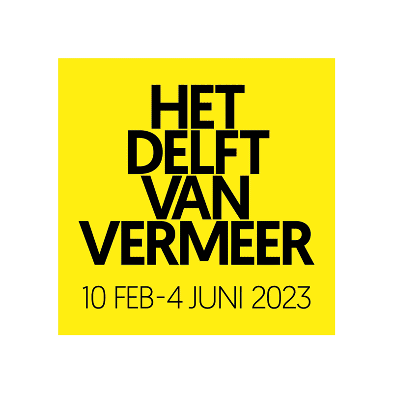
het delft van vermeer - museum prinsenhof delft
Voor de tentoonstelling ‘Het Delft van Vermeer’ in Museum Prinsenhof Delft maakten wij het ontwerp voor campagne, typografie tentoonstelling, signing en familieprogramma.
Een expositie over Vermeer, maar zonder een echte Vermeer aan de wand. Een uitdaging dus om een aantrekkelijke campagne te ontwikkelen zonder een schilderij van hem te laten zien. Het tentoonstellingsontwerp is gemaakt door Bureau Caspar Conijn & Roderik van der Weijden.
Ontwerp en art direction van de campagne, typografie tentoonstelling, signing en familie- en educatieprogramma. In samenwerking met Judith Schoffelen en Caspar Conijn.
–
His life, his city, not his paintings
For the exhibition ‘Vermeer’s Delft’ in Museum Prinsenhof Delft we made the design for campaign, typography exhibition, signing and family program.
An exhibition about Vermeer, but without a real Vermeer on the wall. It is therefore a challenge to develop an attractive campaign without showing one of his paintings. The exhibition design was created by Bureau Caspar Conijn & Roderik van der Weijden.
Design and art direction of the campaign, typography exhibition, signing and family and education program. In collaboration with Judith Schoffelen and Caspar Conijn.
In Coevorden staat sinds april 2023 een monument ter ere van de Drentse politicus Relus ter Beek onthuld. In het bijzijn van onder anderen zijn weduwe, kinderen en kleinkinderen werd de naam van het nieuwe stationsplein bekendgemaakt; het Relus ter Beekplein.
Ontwerp en uitwerking ism. Buro Caspar Conijn, gedicht: Jan Pierre Rawie, productie: Kloosterboer Decor
–
The resident who returned
A monument in honor of Drenthe politician Relus ter Beek has been unveiled in Coevorden since April 2023. In the presence of his widow, children and grandchildren, among others, the name of the new station square was announced; the Relus ter Beek Square.
Design and development in collaboration with Caspar Conijn, poem: Jan Pierre Rawie, production: Kloosterboer Decor
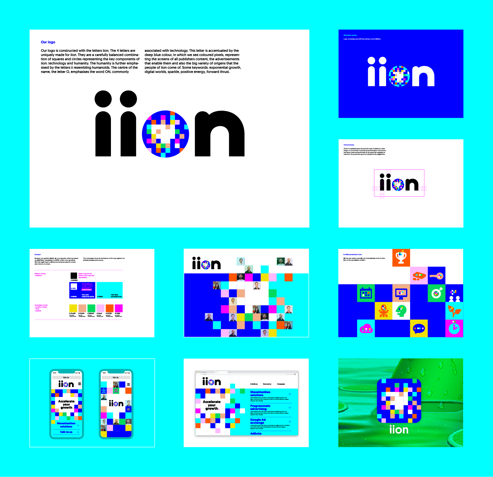
iion is het platform dat game ontwikkelaars en adverteerders met elkaar verbindt. In alle digitale werelden. Geheel in lijn met de razendsnelle groeiversnellers van iion hebben Ferd de Bruijn (merkstrateeg BrandNewton) en ik, in ultra korte tijd, brand manifest, logo, huisstijl en brandbook gerealiseerd.
De 4 letters van het logo zijn uniek gemaakt voor iion. Ze vormen een combinatie van vierkanten en cirkels die de belangrijkste componenten vertegenwoordigen van iion: technologie en menselijkheid. De menselijkheid wordt extra benadrukt door de letters ii. Het centrum van de naam, de letter O, benadrukt het woord AAN, geassocieerd met technologie. Deze letter wordt geaccentueerd door de diepblauwe kleur, waarin we gekleurde pixels zien, de schermen van alle uitgeversinhoud, de advertenties die hen in staat stellen en ook de grote verscheidenheid aan oorsprong van de mensen van iion. Enkele sleutelwoorden: exponentiële groei, digitale werelden, sprankeling, positieve energie, voorwaartse stuwkracht.
–
Identity for a growth accelerator – Corporate identity for iion
iion is the platform that connects game developers and advertisers. In all digital worlds. Completely in line with iion’s rapid growth accelerators, Ferd de Bruijn (brand strategist BrandNewton) and I realized a brand manifesto, logo, house style and brand book in an extremely short time.
The 4 letters of the logo are unique to iion. They form a combination of squares and circles that represent the main components of iion: technology and humanity. Humanity is emphasized by the letters ii. The center of the name, the letter O, emphasizes the word ON, associated with technology. This letter is highlighted by the deep blue color, in which we see colored pixels, the screens of all publisher content, the advertisements that enable them and also the wide variety of origins of the people of iion. Some keywords: exponential growth, digital worlds, sparkle, positive energy, forward momentum.
Je zit in groep 8 van de basisschool en je moet een keuze maken uit het enorme aanbod van middelbare scholen. Maar hoe kom je te weten hoe het er nu echt op een school aan toegaat? Voor het Amstelveen College maakten we een magazine voor groep 8ers.
Een blad vol interviews met brugklassers over de sfeer op school, waarom ze kozen voor een plusprofiel. Er is een test om te checken of het AC bij je past, je leert docenten al wat beter kennen en komt te weten wat de pot schaft in de kantine.
Een laagdrempelige manier om een goed beeld van het Amstelveen college te krijgen.
fotografie: Martijn van de Griendt, redactie: Firma Fluks
–
How is the atmosphere there? – A good idea of Amstelveen College
You are in the last class of primary school and you have to make a choice from the huge range of secondary schools. But how do you find out what is really going on at a school? We made a magazine for the Amstelveen College intended for kids who have to make this choice.
A magazine full of interviews with first graders about the atmosphere at school, why they opted for a plus profile. There is a test to check whether the AC suits you, you get to know teachers a bit better and find out what the food is in the canteen.
An accessible way to get a good picture of the Amstelveen college.
photography: Martijn van de Griendt, editors: Firma Fluks
De Maag Lever Darm Stichting zet zich in voor twee miljoen mensen met een spijsverteringsziekte door onderzoeken te financieren en voorlichting te geven.
Dat ons spijsverteringsysteem van levensbelang is, net als ons hart, onze hersenen en onze longen is een heel belangrijke boodschap die de MLDS aan een grote groep mensen wil vertellen. Te weinig mensen zijn hiervan op de hoogte. Een mooie uitdaging om de huisstijl van de vernieuwde MLDS te laten aansluiten en deze uit te rollen in publieksvoorlichting.
–
A vital story for the Dutch Digestive Foundation
The Dutch Digestive Foundation (MLDS) is committed to helping two million people with digestive diseases by funding research and providing information.
That our digestive system is vital, just like our heart, brain and lungs is a very important message that the MLDS wants to get across to a large group of people. Too few people are aware of this. A nice challenge to match the house style of the renewed MLDS and to roll it out in public information.
De Anne Frank Stichting geeft al 40 jaar de Anne Frank Krant uit. Voor het vijfde achtereenvolgende jaar heb ik samen met Judith Schoffelen de krant en het bijbehorende lesmateriaal ontworpen.
Het lespakket bestaat uit de krant, spel, poster, docentenhandleiding en een digitale les voor groep 7/8 van de basisschool. Voor het eerste jaargang maakten we een minitentoonstelling over Anne’s leven, waarbij de klas wordt verdeeld in zes groepjes. Iedere groep gaat aan de slag met een levensfase van Anne. Als alle groepjes klaar zijn worden de tentoonstellingsborden naast elkaar zetten en heeft de klas een minitentoonstelling over haar leven. De duitse vertaling van krant verzorgen wij ook voor de Anne Frank Tag.
–
History for now – Newspaper and teaching materials Anne Frank Foundation
The Anne Frank Foundation has been publishing the Anne Frank Newspaper for 40 years. For the fifth successive year, I designed the newspaper and the accompanying teaching materials together with Judith Schoffelen.
The teaching package consists of the newspaper, game, poster, teacher’s manual and a digital lesson for group 7/8 of primary school. For the first year, we made a mini exhibition about Anne’s life, in which the class is divided into six groups. Each group will work with a phase of Anne’s life. When all groups are ready, the exhibition boards are placed next to each other and the class has a mini exhibition about her life. We also provide the German translation of newspapers for the Anne Frank Tag.
Stichting Lezen is er om alle kinderen en jongeren het plezier in lezen te laten ontdekken. Van baby tot millenial te helpen om boeken te kiezen die aansluiten bij hun belangstelling.
Nadat we de huisstijl voor Stichting Lezen hebben opgefrist hebben we het kwartaalblad LEZEN onder handen genomen. LEZEN is een tijdschrift voor leesbevordering en literatuureducatie. Samen met de redactie hebben we gewerkt aan een vernieuwingsslag zodat het blad na 16 jaar meer uitnodigt tot eh… LEZEN!
In de nieuwe communicatiestijl van Stichting Lezen ontwikkelen Judith Schoffelen & ik diverse middelen. Daarnaast ontwikkelen we voor verschillende leeftijdsgroepen kleine campagnes; promotie van babyboekjes, voorleeswedstrijd voor brugklassers en een leeskalender voor middelbare scholieren.
–
Read now, read later – Communication and campaigns
The Reading Foundation is there to let all children and young people discover the pleasure of reading. Helping infants to millennials choose books that match their interests.
After we refreshed the corporate identity, we took care of the quarterly magazine LEZEN (Reading). LEZEN is a magazine for reading promotion and literature education. Together with the editors, we have worked on an innovation so that after 16 years the magazine invites more to eh… READ!
In the new communication style of Stichting Lezen, Judith Schoffelen & I develop various resources. In addition, we develop small campaigns for different age groups; promotion of baby books, reading competition for first graders and a reading calendar for secondary school students.
Een man op een scooter, een echtpaar met boodschappen, een wandelaar – ze staan stil bij de geschiedenis van hun stad. Een geschiedenis omgezet in de Stad als Museum, een permanente buitententoonstelling die bestaat uit tien tot de verbeelding sprekende sculpturen, met prachtige gedichten van Jean Pierre Rawie en toelichtende verhalen. Deze tentoonstelling verheft de stad tot museum, maakt haar bewoners trots en vertelt bezoekers wat er in het verleden is gebeurd.
Coevorden: getekend en geteisterd
De stad, Coevorden, is de meest geteisterde van Nederland. Wie er een schep in de grond steekt, graaft alleen maar scherven op. In samenwerking met Buro Caspar Conijn maakten wij deze gehavende geschiedenis zichtbaar. De vorm is uniek: poëzie, verhalen en beeldende kunst – samengebald in tien sculpturen, verspreid over de stad.
Een nieuwe en ongekende manier van citymarketing
We hebben twee dingen bereikt: Coevorden verrijkt met beeldende kunst én een aansprekende stadswandeling gecreëerd. Dit is nieuw. Ze combineren schoonheid en toegankelijkheid zonder toe te leggen op kwaliteit. Met De Stad als Museum positioneert Coevorden zich als een stad waar de historie op niveau te beleven is.
–
The City as a Museum – Permanent outdoor exhibition city of Coevorden
A man on a scooter, a couple with groceries, a walker – they reflect on the history of their city. A history turned into the City as Museum, a permanent outdoor exhibition consisting of ten evocative sculptures, with beautiful poems by Jean Pierre Rawie and explanatory stories. This exhibition elevates the city to a museum, makes its residents proud and tells visitors what happened in the past.
Coevorden: scarred and ravaged
The city Coevorden, is the most afflicted in the Netherlands. Anyone who puts a shovel in the ground only digs up shards. In collaboration with Buro Caspar Conijn, we made this battered history visible. The form is unique: poetry, stories and visual art – condensed into ten sculptures, spread across the city.
A new and unprecedented way of city marketing
We have achieved two things: enriched Coevorden with visual art and created an appealing city walk. This is new. They combine beauty and accessibility without focusing on quality. With The City as a Museum, Coevorden positions itself as a city where history can be experienced at a high level.
Probiblio is de organisatie die de bibliotheken in de provincies Noord- en Zuid-Holland ondersteunt. Voor Probiblio heb ik aan allerlei maatschappelijke thema’s rond geletterdheid gewerkt.
Een jaarlijks hoogtepunt is het landelijke congres Bibliotheek Plaza. Samen met copywriter Marcel Jiskoot hebben ik afgelopen vijf jaar het gezicht gegeven aan deze inspiratiedag.
–
Against illiteracy – Communication and campaigns for Probiblio
Probiblio is the organization that supports the libraries in the provinces of North and South Holland. For Probiblio I worked on all kinds of social themes related to literacy.
An annual highlight is the national conference Library Plaza. Together with copywriter Marcel Jiskoot, I have given the face to this inspirational day over the past five years.
De Branchevereniging Nederlandse Architectenbureaus (BNA) vertegenwoordigt al meer dan 175 jaar de rol van de architect in de maatschappij. Met ontwerpen voor allerlei middelen draag ik ook mijn steentje bij aan de bouwkunst in Nederland.
–
Build the architectural industry
The Royal Institute of Dutch Architects (BNA) has been representing the role of the architect in society for more than 175 years. With designs for all kinds of items, I also build on architecture in the Netherlands.
In Nederland kampen twee miljoen mensen met PDS. De PDSB (Prikkelbare Darm Syndroom Belangenorganisatie) is er voor deze patiënten met voorlichting, lotgenotencontact en belangenbehartiging.
–
Irritable issues – Logo and icons for the PDSB
In the Netherlands, two million people suffer from IBS. The PDSB (Irritable Bowel Syndrome Interest Organization) is there for these patients with information, peer contact and advocacy.
Op een gebouw aan de Hilversumse Larenseweg prijkt het woord MELKFABRIEK, in bolle, bijna vloeiende letters, alsof ze op het punt staan over te lopen. Een streep eronder gaat de hoek om naar de voorgevel en leidt naar de ingang.
’s Avonds komt er een verrassing: in iedere letter verschijnt – verlicht – een andere letter. Samen vormen ze de tekst GOED VOOR ELK. Het is een knipoog naar een slogan uit de jaren vijftig (‘Melk, goed voor elk’), die in het collectieve geheugen staat gegrift.
De boodschap is duidelijk: de Melkfabriek borrelt bijna over. De Melkfabriek is goed voor elk. Overdag, ’s avonds en ’s nachts. Het bruist in het gebouw, dat tot 2005 is gebruikt om zuivel te produceren en in hetzelfde jaar werd uitgeroepen tot gemeentelijk monument. Inmiddels heeft Dudok Wonen het gerenoveerd en zijn er bedrijven, appartementen, een crèche, een basisschool en een buitenschoolse opvang. Er wordt gewoond, gewerkt, geleerd of gewoon even bijgekletst bij een cappuccino.
Op de voorgevel staat een losse letter M, die de werkdagen markeert. ’s Avonds verschijnt in deze letter de contour van een melkfles, die iedere dag voller wordt. Tot het weekend, dan is de fles leeg om op maandag opnieuw te worden gevuld.
Het ontwerp, tot stand gekomen in samenwerking met Studio Verreijt, doet recht aan het dynamische karakter van de Melkfabriek. Het is een kroon op het renovatiewerk en een cadeau aan het gebouw en zijn nieuwe gebruikers.
–
Object with a surprise – Facade object for a former dairy factory
The word MELKFABRIEK (dairy factory) adorns on a building in Hilversum, in convex, almost flowing letters, as if they are about to overflow. A line below goes around the corner to the front facade and leads to the entrance.
In the evening there will be a surprise: in each letter appears – illuminated – another letter. Together they form the text GOED VOOR ELK (good for each). It is a nod to a slogan from the 1950s (“Milk, good for everyone”), which is etched in the collective memory.
The message is clear: the Milk Factory is almost bubbling over. The Milk Factory is good for everyone. Daytime, evening and at night. The building is buzzing with life, which was used to produce dairy until 2005 and was declared a municipal monument in the same year. Dudok Wonen has now renovated it and there are companies, apartments, a crèche, a primary school and an out-of-school care facility. People live, work, learn or just chat over a cappuccino.
On the facade is a separate letter M, which marks the working days. In the evening the outline of a milk bottle appears in this letter, which becomes fuller every day. Until the weekend, then the bottle is empty to be refilled on Monday.
The design, created in collaboration with Studio Verreijt, does justice to the dynamic character of the dairy factory. It is a crown on the renovation work and a gift to the building and its new users.
Afbeeldingen met zeggingskracht
–
Iconmatics
Images with expressiveness
In het kader van humor in de schilderkunst is voor de afdeling kindereducatie van het Frans Hals Museum in Haarlem van bestaande schilderijen uit de 17e eeuwse collectie een 3D-opstelling gemaakt.
Samen met Caspar Conijn heb ik een schilderachtige setting gemaakt waar kinderen (tot 85 jaar) in kunnen plaatsnemen en met behulp van gekke voorwerpen uit schilderijen een personage tot leven kunnen brengen. Wie maakt de leukste foto?
–
Laughing with Frans – HaHaHa at the Frans Hals Museum
In the context of humor in painting, a 3D arrangement has been made of existing paintings from the 17th century collection for the children’s education department of the Frans Hals Museum in Haarlem.
Together with Caspar Conijn I created a picturesque setting where children (up to 85 years old) can take a seat and bring a character to life with the help of crazy objects from paintings. Who takes the best photo?
Een afscheidskado voor Henk Everts, een heel bijzondere opdrachtgever van de gemeente Coevorden. Voor zijn afscheid heb ik een watergesneden roestvrijstalen object gemaakt op basis van een voor deze gelegenheid op maat geschreven kwatrijn door dichter Jean Pierre Rawie.
–
Monument to a monument – Goodbye to Henk
A farewell gift for Henk Everts, a very special client of the municipality of Coevorden. For his farewell, I made a water-carved stainless steel object based on a custom-written quatrain by poet Jean Pierre Rawie for this occasion.
Ook zonder concrete opdracht is mijn werk mijn hobby. Speciaal bij onderwerpen die mij aan het hart liggen. Zo heb ik na jaren luisteren naar Thom Yorke eindelijk iets terug gedaan en zijn portret gemaakt. Trump is daarentegen een antiheld en daarom zeker ook de moeite waard. Tijdens het maken van zijn portret kwam stiefdochter Liv (toen 7) even langs en zei enthousiast: ‘Oh leuk Erik, Obama!’
–
Free work – illustrations
Even without a concrete assignment, my work is my hobby. Especially on topics that are close to my heart. For example, after years of listening to Thom Yorke, I finally did something in return and made his portrait. Trump, on the other hand, is an anti-hero and therefore certainly worth it.
B&T, organisatie adviesbureau voor het onderwijs, zoekt talentvolle trainees in het onderwijs. Elke potentiële kandidaat is wel ergens een uitblinker in en zal zich herkennen in één van de profielen. Vanuit deze gedachte heb ik in samenwerking met Symen Veenstra verschillende uitblinkers uitgewerkt met aansprekende namen en korte triggerende copy. Dat zet in elk geval aan tot een sollicitatiegesprek; volgens B&T was het aantal sollicitanten 2,5 x zo hoog als normaal.
–
Turn on the interview – How to trigger your trainees
B&T, a consultant agency, is looking for talented trainees in education. Every potential candidate excels in something and will recognize himself in one of the profiles. Based on this idea, I have worked out several highlights with appealing names and short triggering copy in collaboration with Symen Veenstra. In any case, that encourages a job interview; according to B&T, the number of applicants was 2.5 times higher than normal.
Samen met Caspar Conijn hebben we een oorlogsmonument ontworpen dat aansluit bij de stijl van de historische route ‘Scherven van een stad’ die we kort daarvoor hebben gerealiseerd. Door de hele stad Coevorden staan nu monumentale objecten die tezamen die historie in beeld en tekst vertellen.
–
Memorable
Together with Caspar Conijn, we designed a war memorial that matches the style of the historic route ‘Shards of a city’ that we realized shortly before. Throughout the city of Coevorden there are now monumental objects that together tell that history in image and text.
Voor gebieds- en vastgoedontwikkelaar AM is een nieuwe reeks onderzoeksuitgaven ontwikkeld; ‘Woningmarkt in zicht’. Met actuele thema’s als woonperspectieven voor Amsterdamse middenklasse gezinnen, duurzame woonwensen en het wonen in hoge dichtheden laat AM zien wat er op dit moment speelt in de gebieds- en vastgoedontwikkeling. Boekjes met een heldere lay-out, duidelijke infographics en hele knappe modellen in hun natuurlijke habitat 😉
–
Development of insights – Research publications AM Real Estate
A new series of research publications has been developed for real estate developer AM; Housing market in sight. With current themes such as housing perspectives for Amsterdam middle-class families, sustainable housing requirements and living in high densities, AM shows what is currently going on in area and property development. Booklets with a clear layout, clear infographics and very handsome models in their natural habitat 😉
Samen met Judith Schoffelen hebben ik Locus gerestyled en zodanig in een totaal nieuw jasje gestoken: nieuw logo en lay-out. Locus is het magazine van PropertyNL over gebieden, gemeenten en gebruikers dat verschijnt als bijlage bij het Financieel Dagblad.
–
Focus – On Locus
Together with Judith Schoffelen I restyled Locus and gave it a completely new look: new logo and lay-out. Locus is PropertyNL’s magazine about areas, municipalities and users that appears as an appendix to the Financieel Dagblad.
14 september / Dag van de Scheiding
Als je van plan bent om het met je toekomstige ex de zaken goed geregeld te hebben dan kan je op deze dag bij familierechtadvocaten binnenlopen voor informatie of een check. De campagne hiervoor heb ik gemaakt toen ik werkzaam was bij bij Total Identity; een mediamix van outdoor, radio, print met als haakje het woordje ‘Ex’ waar ik verschillende woorden mee heb gemaakt die betrekking hebben tot waar men mee te maken heeft in de moeilijke situatie van het uit elkaar gaan.
–
EXposure – September 14 / Day of the divorce
If you intend to have things well arranged with your future ex, you can visit family lawyers on this day for information or a check. I created the campaign for this when I worked at Total Identity; a media mix of outdoor, radio, print with the word ‘Ex’ as a hook with which I made several words related to what one is dealing with in the difficult situation of breaking up.
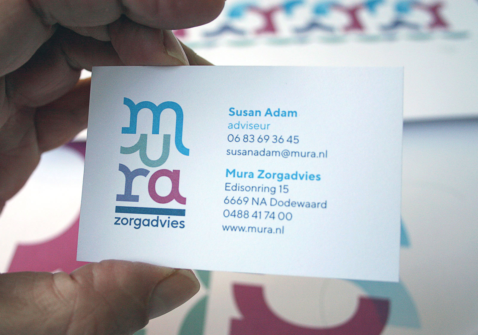
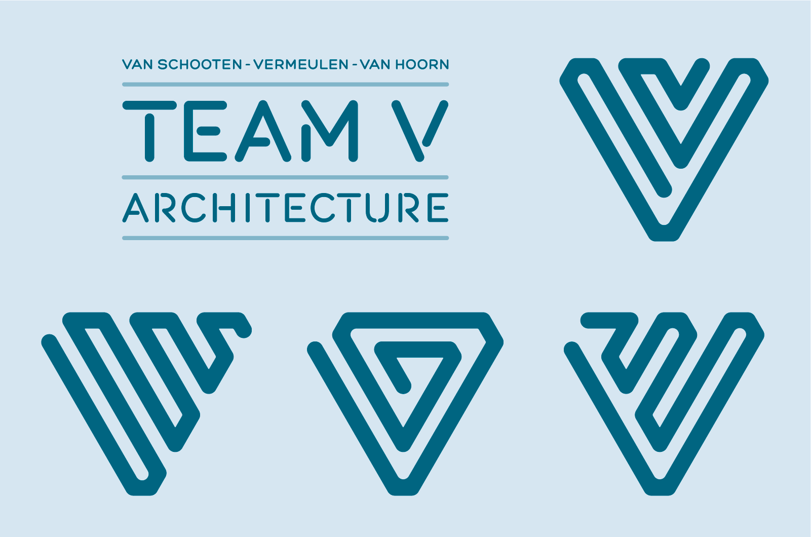
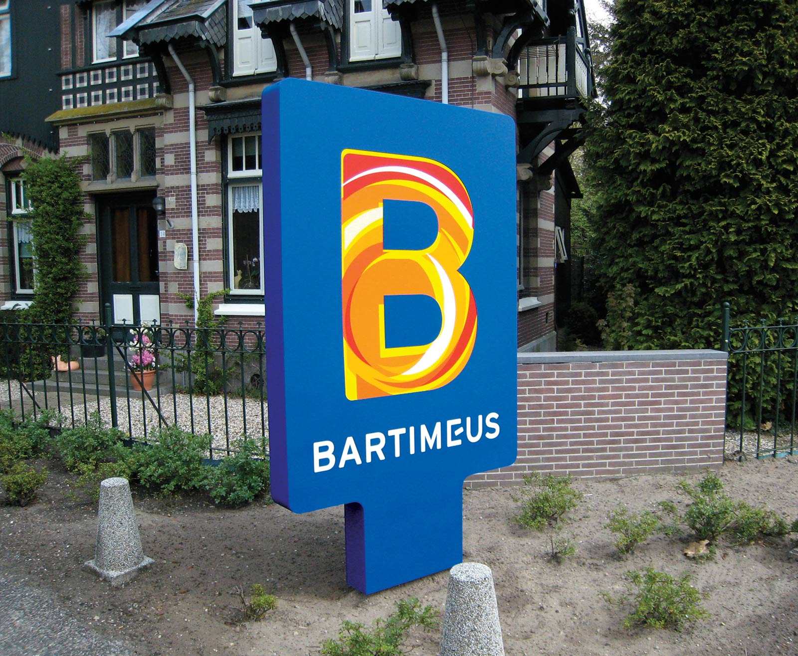
Logotypes and corporate identities